David Seaton's News Links
Today, instead of pontificating, I'd like to ask readers opinions and conclusions after perusing the maps that I've stuck on here below. They are a map of the 2008 election results, county by county, a map of "purple America" from 2004 and a map of American's median income from 1999 (I haven't found any more recent maps, but I imagine they wouldn't be dramatically different).
Please take a look:
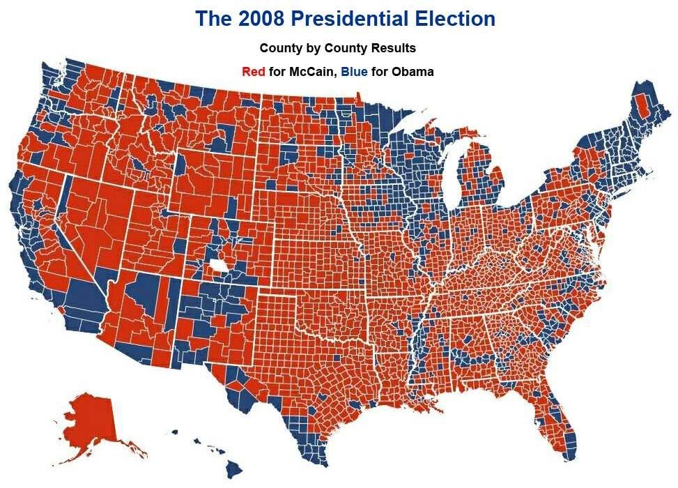
2008 election results - county by county
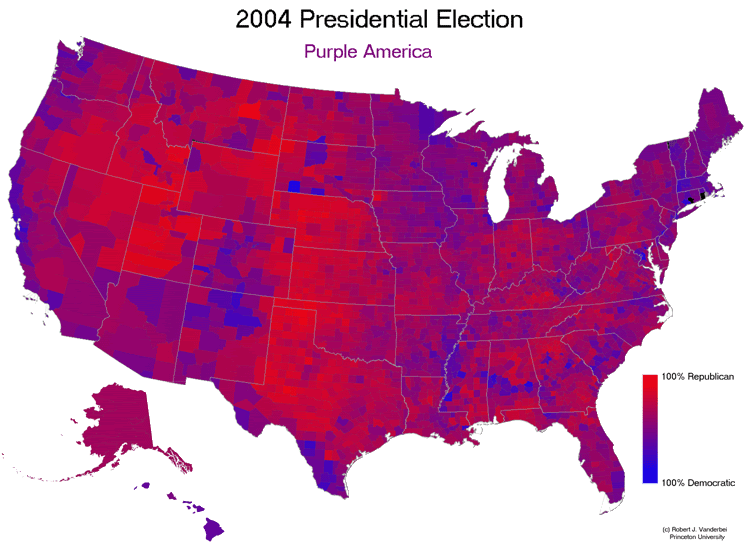
"Purple America" - 1999
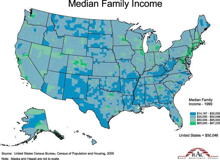
Median family income - 1999
Right off the bat they look to me like a pre-war ethnic map of Bosnia, with the Serbs, Croats and Muslims all mixed up and only held together by Marshall Tito's iron hand.
Like this:

My "start a bar fight" proposition would be that easy, subprime type credit has been America's answer to "Marshall Tito" and that stagnant or shrinking incomes, without access to that easy credit (something that will probably last long beyond the present crisis) will produce great tension in America's mosaic.
Personally I think the income distribution chart is more important than the others as it is much easier to change your vote than to change your income.
In that map we see islands of wealth and archipelagos of poverty in a sea of neither one nor the other. My working hypothesis is that the (permanent) loss of the kind of credit that produced the bubble will be like a painkiller wearing off of someone who has been in a terrible accident and this sudden lucidity and access to agony will produce enormous political tensions.
I would be grateful for all opinions and, of course, but especially for those that are fact-filled and wonky. DS
Today, instead of pontificating, I'd like to ask readers opinions and conclusions after perusing the maps that I've stuck on here below. They are a map of the 2008 election results, county by county, a map of "purple America" from 2004 and a map of American's median income from 1999 (I haven't found any more recent maps, but I imagine they wouldn't be dramatically different).
Please take a look:
2008 election results - county by county
"Purple America" - 1999
Median family income - 1999
Right off the bat they look to me like a pre-war ethnic map of Bosnia, with the Serbs, Croats and Muslims all mixed up and only held together by Marshall Tito's iron hand.
Like this:
My "start a bar fight" proposition would be that easy, subprime type credit has been America's answer to "Marshall Tito" and that stagnant or shrinking incomes, without access to that easy credit (something that will probably last long beyond the present crisis) will produce great tension in America's mosaic.
Personally I think the income distribution chart is more important than the others as it is much easier to change your vote than to change your income.
In that map we see islands of wealth and archipelagos of poverty in a sea of neither one nor the other. My working hypothesis is that the (permanent) loss of the kind of credit that produced the bubble will be like a painkiller wearing off of someone who has been in a terrible accident and this sudden lucidity and access to agony will produce enormous political tensions.
I would be grateful for all opinions and, of course, but especially for those that are fact-filled and wonky. DS

